What I do
I help individuals and companies refine or develop the experience of their products, tools and digital strategies.
interdisciplinary designer
I help individuals and companies refine or develop the experience of their products, tools and digital strategies.
Analysis
Information Architecture
Accessibility
Design System
Interaction and Motion Design
Problem Solving
Prototyping and 3D Modeling
Usability Testing
Visual and Product Design
With the growing demand for coherent design systems, this tailor-made training program aimed to equip participants with the skills to effectively manage and communicate design systems, meeting accessibility and usability standards while fostering cross-stakeholder engagement.
Initial Issues
Goals
1. Developed a Comprehensive UI Kit
Participants successfully created a well-structured component library in Figma, encompassing a variety of UI components tailored to their specific needs.
2. Improved Component Standards
Existing components were enhanced to meet accessibility standards and ergonomic criteria, ensuring better usability for all users.
3. Enhanced Team Skills
Participants gained practical skills in CSS and design principles, enabling them to maintain and extend the design system independently.
4. Established Documentation Practices
A documentation strategy was developed, facilitating maintenance and promotion of the design system throughout the organization.
5. Increased Consistency and Efficiency
The newly established design system brought greater consistency and efficiency to the product development process, reducing design inconsistencies and streamlining workflows.
6. Stronger Stakeholder Communication
Participants learned effective strategies for communicating the design system’s value and functionality to stakeholders, fostering greater buy-in and support.
In conclusion, the training program successfully empowered participants to create a cohesive design system in Figma, improving component standards for accessibility and usability. Robust documentation practices were established to ensure long-term scalability and consistency in product development, fostering innovation and design integrity across projects.
Training Program (FR), 2 min to read
A social secretariat providing payroll management tools, human resources consulting, and legal assistance to companies.
Initial Issues
Goals
1. Research
✓ Analytical Data Analysis: Identify the most visited pages and high bounce rates.
✓ Competitor Study: Analyze competitor sites to identify best practices and missing features.
2. Definition of Scenarios
✓ Development of usage scenarios for each user to guide design and testing.
3. Information Architecture
✓ Card Sorting User Test: Organization and execution of user test with project stakeholders.
✓ Tree Structure: Reorganization of the site structure to simplify navigation.
✓ Rewriting: Redefinition of terms used for navigation.
4. Visual Design
✓ Improvement of the professional visual identity.
✓ Creation of high-fidelity models incorporating the new visual identity and wireframes.
5. Development and Integration
✓ Front-end and Back-end Development: Programming of new features and integration of the new design.
✓ Compatibility Tests: Ensure that the site works on different browsers and devices (desktop, tablet, mobile).
6. Launch and Iteration
✓ Soft Launch: Launch the site in beta phase for a limited group of users.
✓ Post-launch Feedback Collection: Collect user feedback after launch and make necessary adjustments.
1. Improved Accessibility and User Satisfaction:
— Intuitive and fast navigation.
— Easy access to essential information.
— Consistent experience of company content.
2. Modernization of the Company Image:
— Visually attractive and professional interface.
— Strengthening credibility and user trust.
3. Mobile Compatibility and Accessibility:
— Consistent user experience across all devices.
— Improved accessibility for users with specific needs.
The website redesign required a user-centric approach, incorporating extensive research, strategic planning, and rigorous testing to ensure an optimal user experience. By following these steps, we were able not only to improve user satisfaction but also to strengthen its brand image and competitiveness in the market.
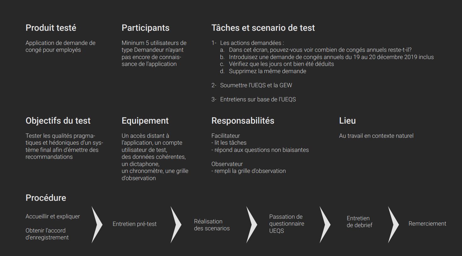
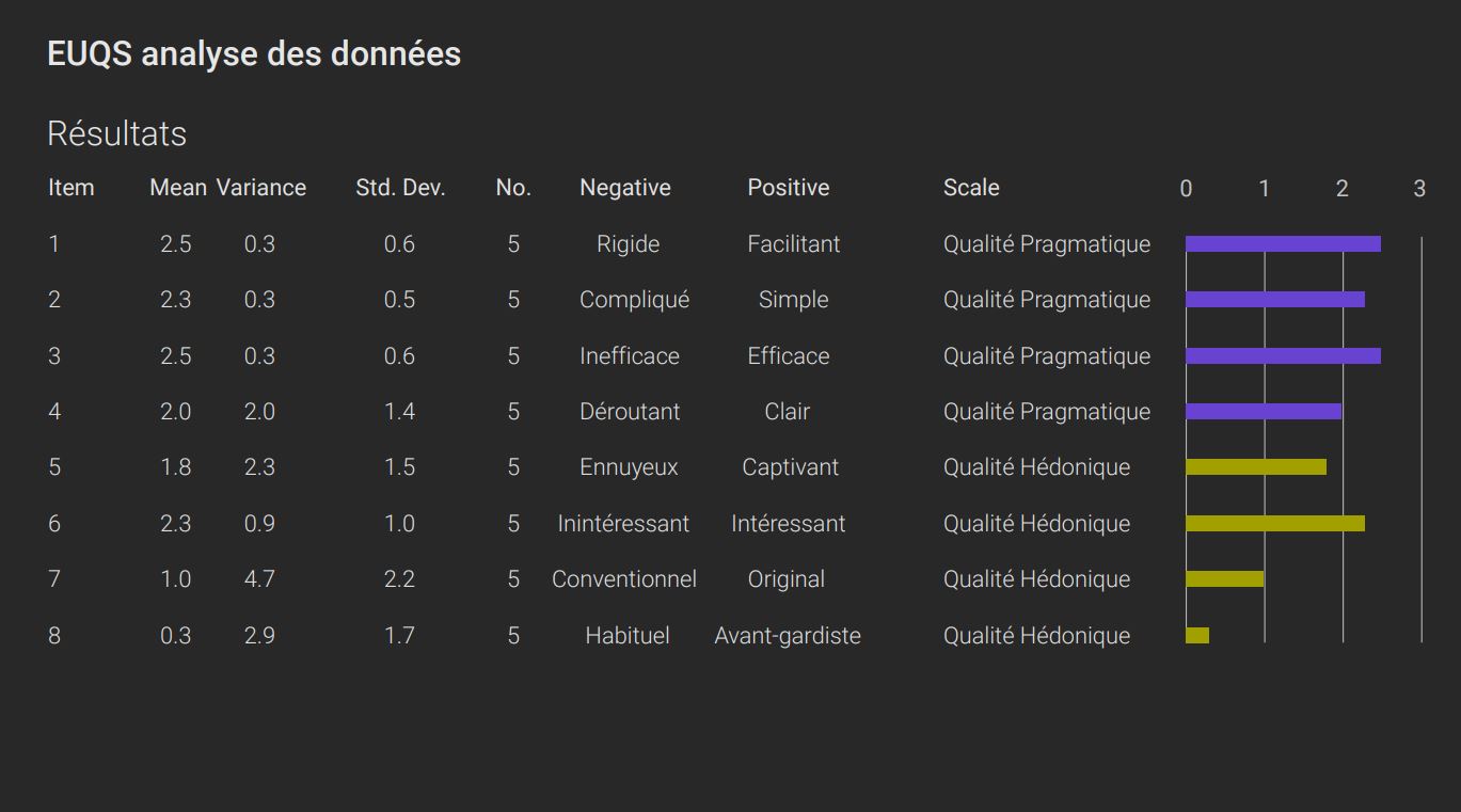
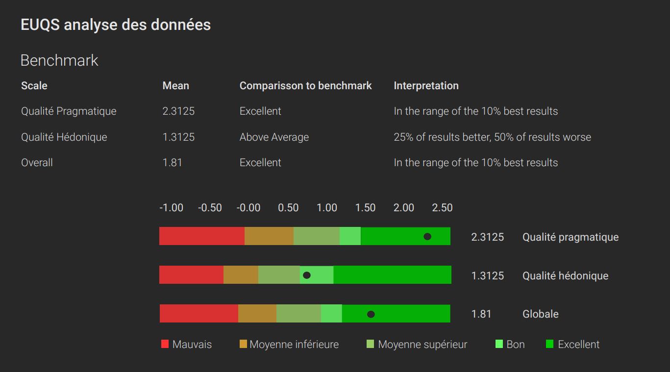
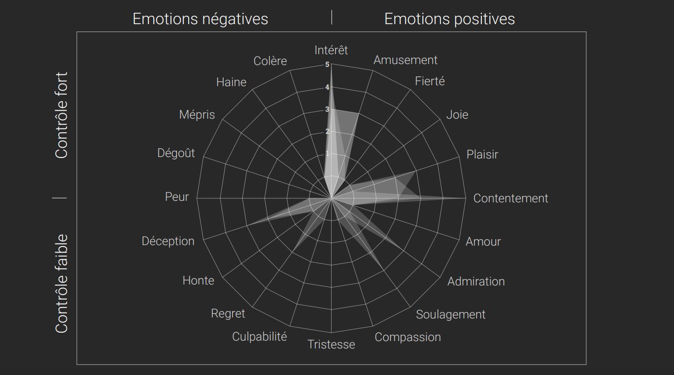
During this test, four critical tasks were required to evaluate a user journey. The UEQ and GEW questionnaires were also administered to participants to support usability and emotion measurements.
(2 facilitators)
The current leave management interface presented several challenges:
For each task, we identified user expectations and proposed tailored solutions:
Task 1 — Visualizing Leave Balance
Task 2 — Submitting Leave Requests
Task 3 — Deducted Days
Task 4 — Deleting Leave Requests
The tests highlighted essential areas for improvement to optimize the ergonomics of the leave management application.
Recommendations:
These improvements provide a smoother and more efficient user experience, meeting the specific needs and expectations of the users.
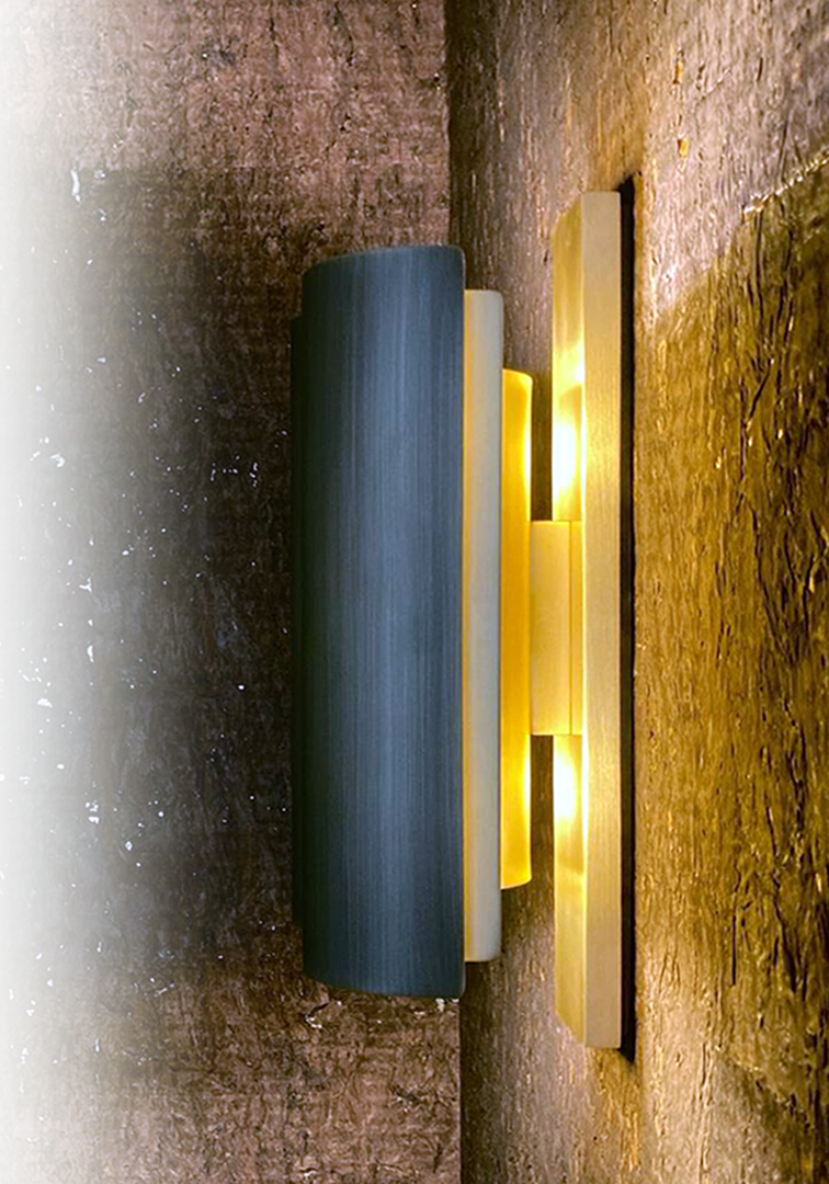
A wall light created in collaboration with Zed Artisan .
My role was to contribute to the research of design and manufacturing solutions. The wall light was modeled in 3D for study, prototyped, and then manually produced in 8 editions. Each part of the lamp is handcrafted. It is made entirely of brass, with the front face acid-browned and the back satin-finished.
Special care was taken in the design and assembly to ensure not only a refined aesthetic but also optimal functionality. Visual comfort was a major priority: the lamp is designed to direct the light to enhance its radiance on materials, while diffusing it indirectly to avoid glare. We also ensured a good distribution of light to provide uniform and pleasant illumination. Finally, the design allows for easy access to the light sources, making maintenance simple and practical, thus ensuring ease of use.